 Studio Elena
Rituals for the body and for silence.
Concept identity for a boutique ritual spa — a quiet, design-led sanctuary where treatments are reimagined as slow rituals rather than clinical procedures.
The brand takes its name from nacre (mother-of-pearl): the inner light of a shell, formed slowly, in silence. It became the guiding metaphor for the entire identity — beauty that reveals itself through patience and calm.
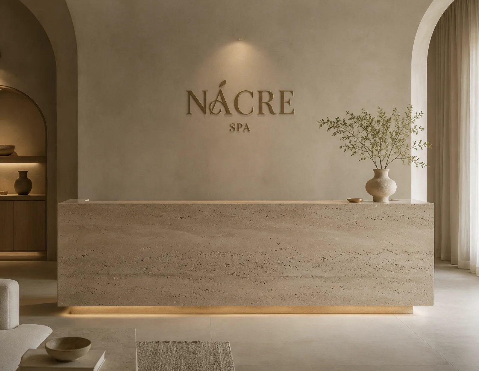
A design-aware clientele, 28–50, mostly urban professionals who spend on experiences over things. They value privacy, natural materials and slowness, and they read a brand’s taste before they read its price.
They discover places through Instagram, interiors magazines and word of mouth — so the identity had to be as photogenic as it is functional.
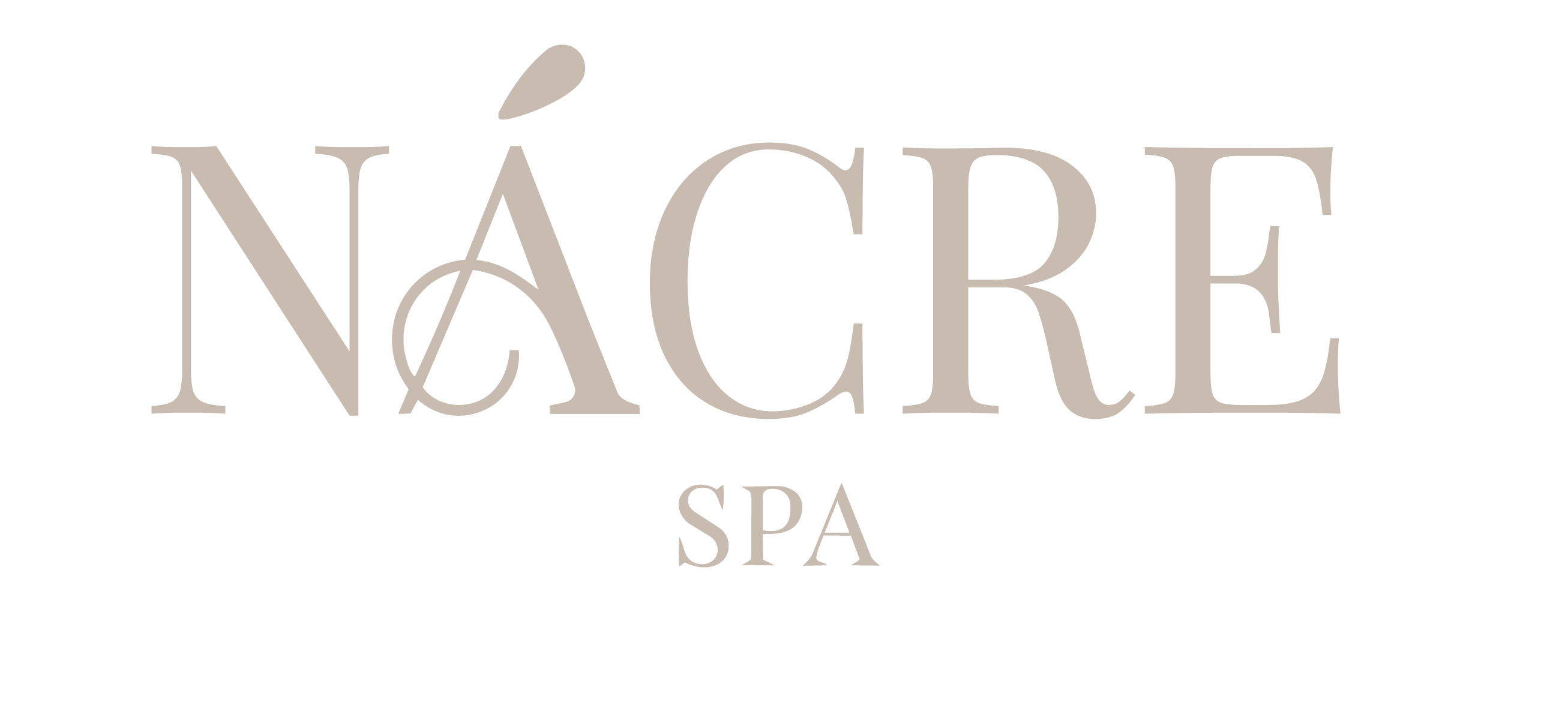

At the heart of the identity sits the Ñ monogram — a single letter drawn with the slow, deliberate curve of a shell’s inner lip. It works embossed on a card, stamped on a candle,
or quietly woven into a linen robe.
Stationery, packaging and collateral share one palette — travertine, sand, clay and a single sage accent — so every piece reads as part of the same ritual.
Uncoated papers, tone-on-tone printing and generous negative space let the materials, not the ink, carry the luxury.
The finished identity moves between two registers: warm and tactile in daylight,
low and intimate after dark. A palette of stone, sand and pearl lets every surface
breathe while staying unmistakably NÁCRE.
From the reception wall to the smallest sample sachet, each touchpoint was
made to be photographed, shared and remembered — an identity as slow
and considered as the rituals it represents.
Beauty revealed slowly, in silence.